Putting race day in fans’ hands.
Verizon wanted to give IndyCar fans a reason to do more than stop by its tent. Our team created a mobile web experience that connected race-day information, opportunities to win, and an immersive glimpse of life behind the wheel.
From checking the weekend schedule to stepping into the cockpit.
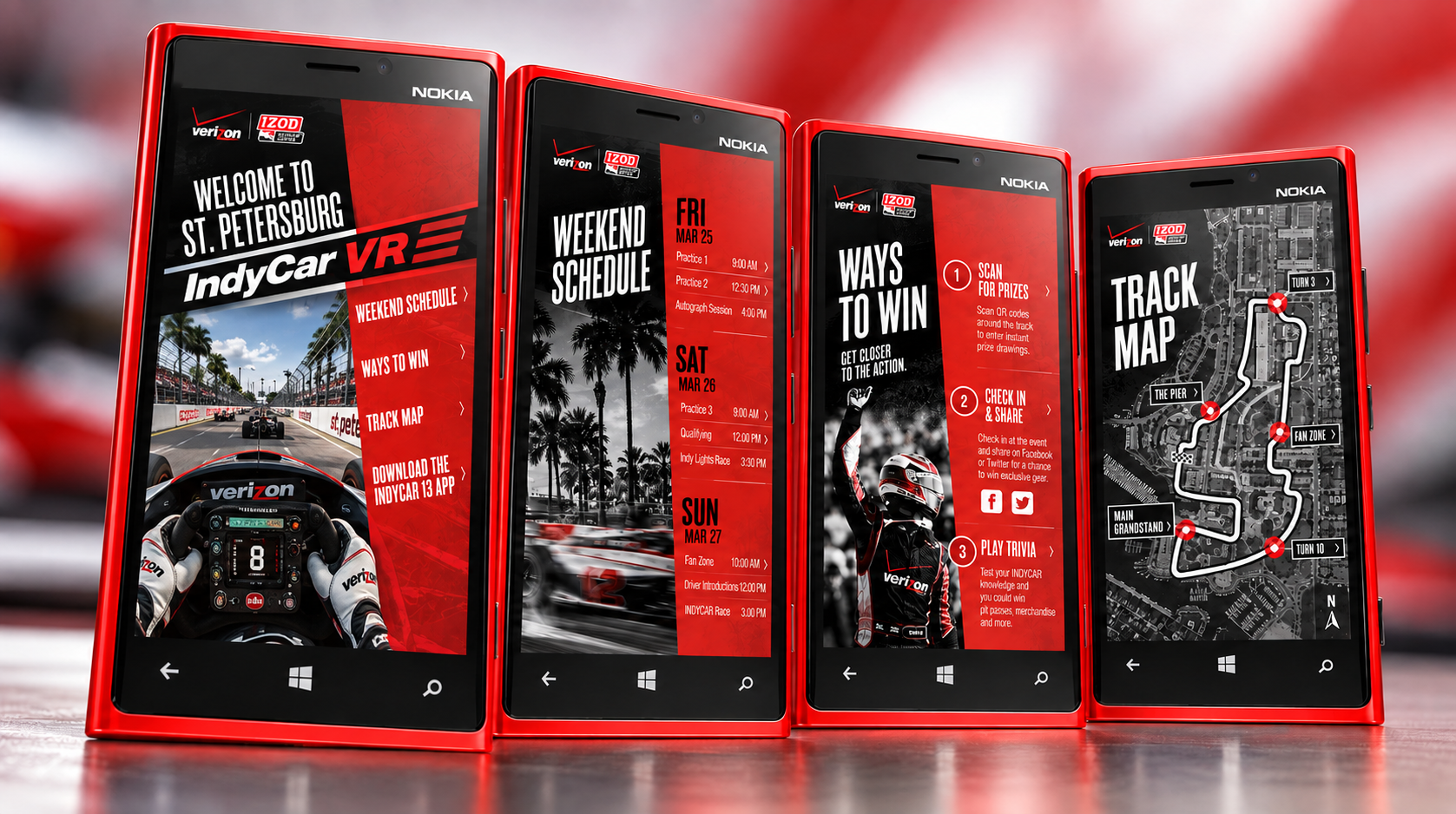
Give fans a reason to pick up the phone.
Verizon came to our team with a two-sided brief. The activation had to show off Verizon’s new demonstration devices inside its tent, and it had to give race fans something useful and memorable in the middle of a busy race weekend.
A race weekend competes for every minute of attention. Fans are moving between sessions, looking for their seats and deciding where to go next. Whatever we built had to earn a few seconds of that attention and pay it back quickly.
That set three design priorities: help people find event information fast, make the ways to participate easy to discover, and make the VR experience impossible to miss.
Yes, that’s a Nokia.
The hardware places this project in a particular moment. The challenge still feels familiar: give people a clear reason to try a new experience, and make getting started easy.
NOTE — Device imagery on this page is a reconstructed presentation mockup, not an archival photograph from the event.
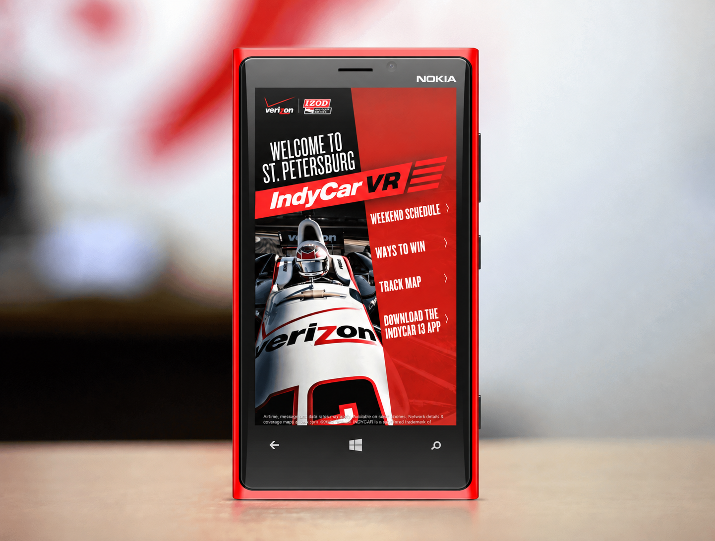
Five destinations. One clear starting point.
The experience was organized around five questions a visitor brings to race day. Each one got its own destination, and the homepage pointed to all of them.
Make the next move obvious.
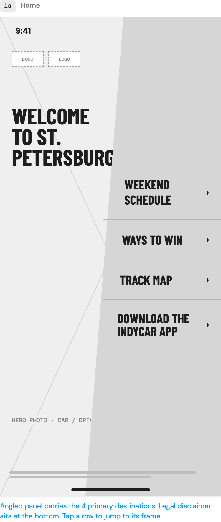
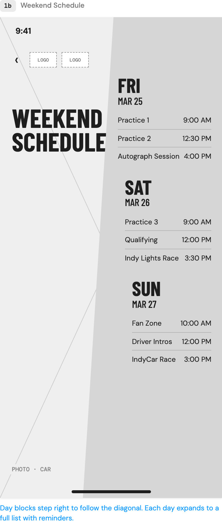
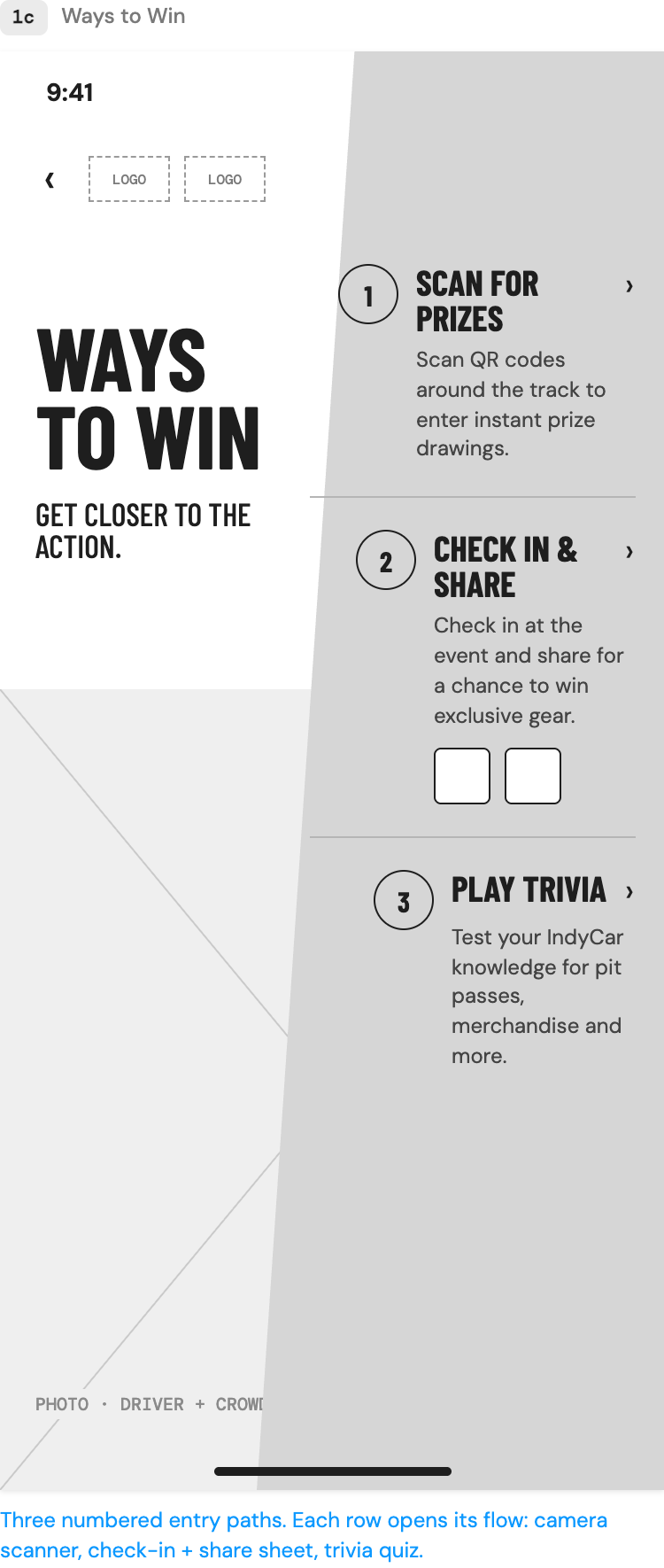
The wireframes set the structure every screen shares: a large heading on one side, an angled panel carrying the content on the other, and direct navigation with a clear arrow on every row. Each screen holds one distinct group of information.
The home wireframe shows four primary destinations. It doesn’t yet include the VR entry point, which appears above the navigation in the finished homepage.
A race-day companion with a seat in the cockpit.
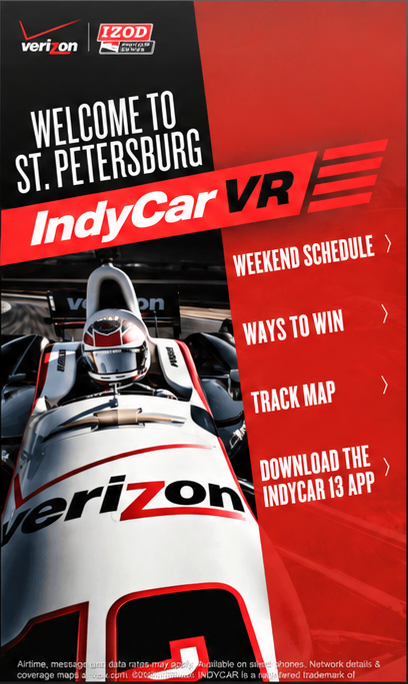
The homepage does two jobs. It gets fans to practical information in a single tap, and it puts the VR experience right at the top, where nobody can miss it. The VR banner sits above the navigation, so it stands out without pushing the essentials off the screen.
Built to feel like race day.
The product borrowed its look from the track. It’s loud where the portfolio around it is quiet, and each choice has a job to do.
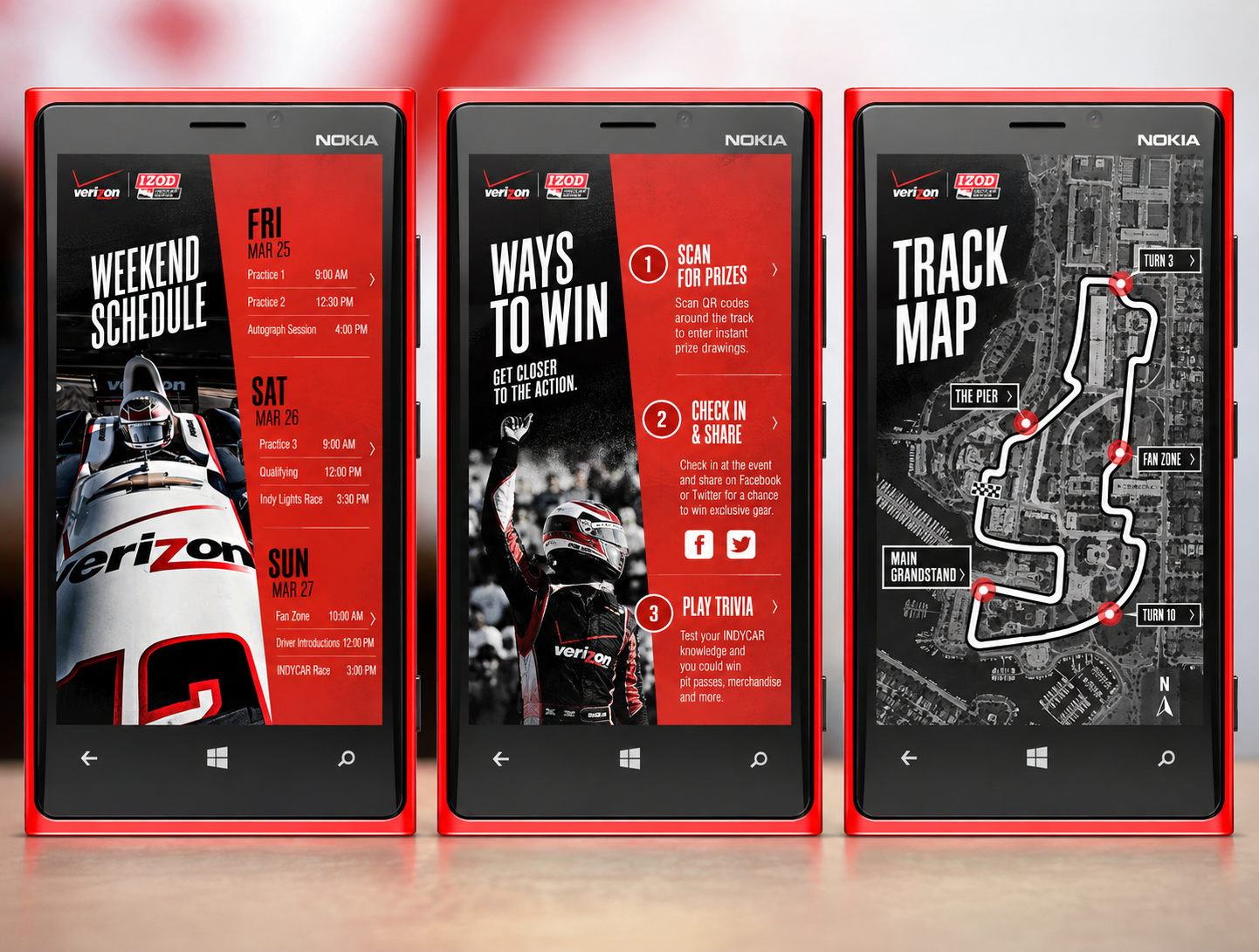
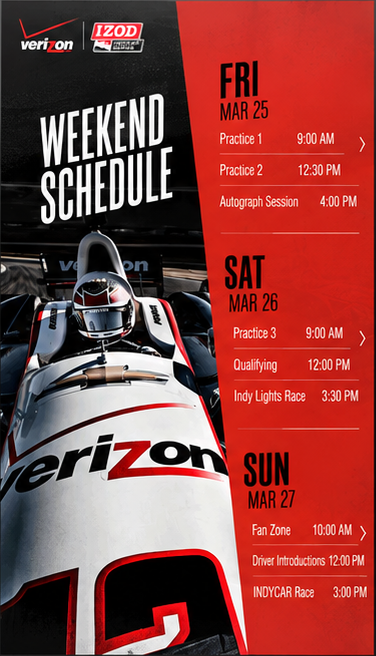
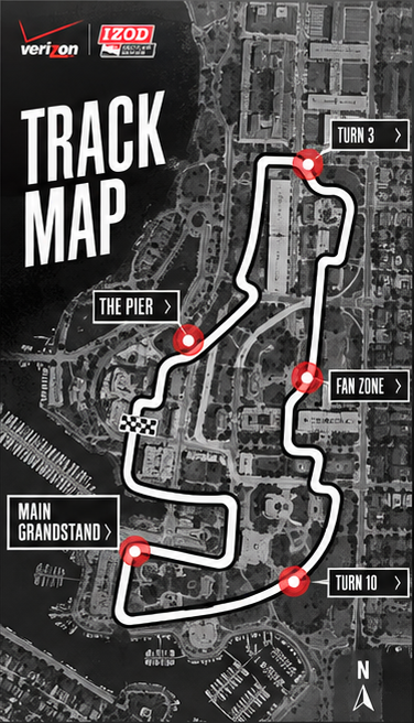
The right information, right when fans need it.
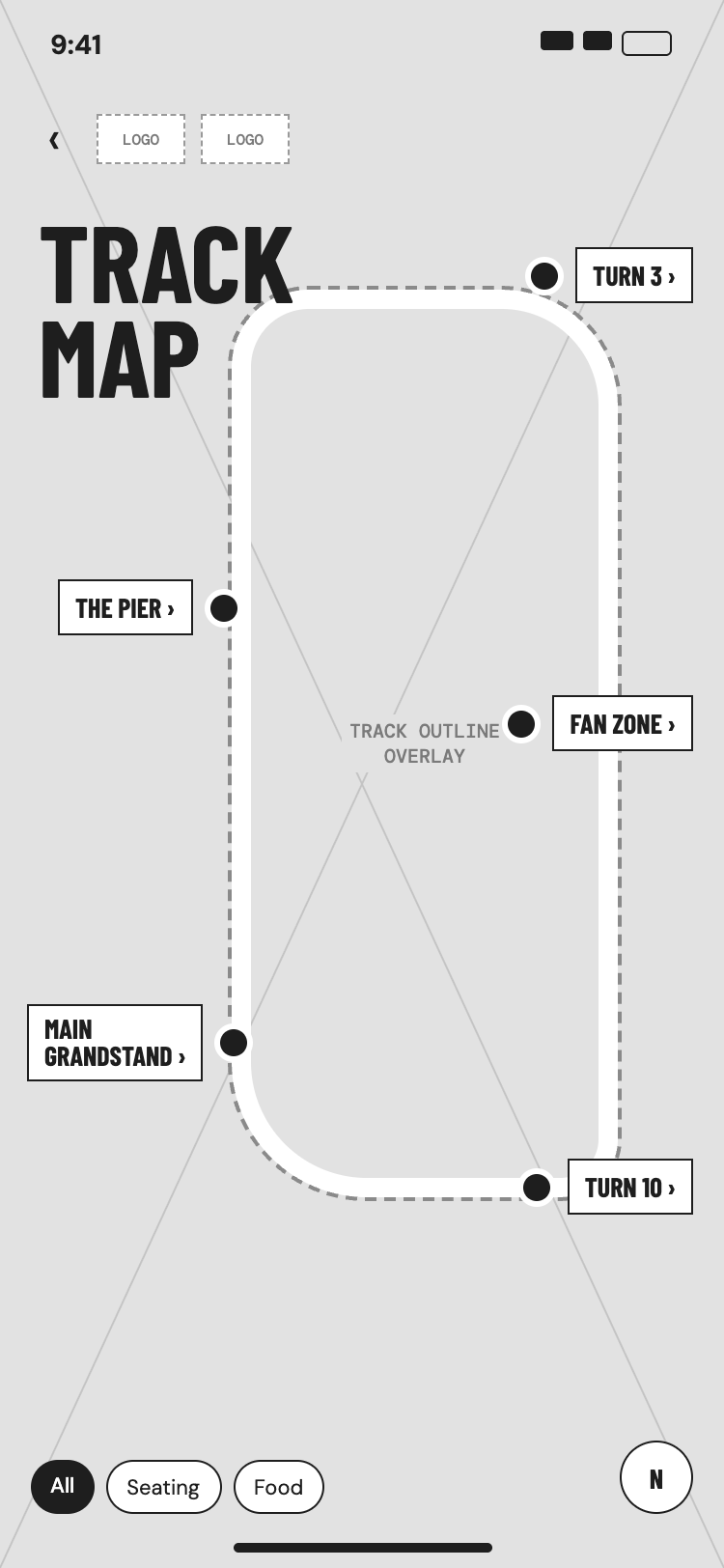
The schedule and the map answer two different questions. The schedule helps people plan their time across three days, and the map helps them find their way around the venue once they’re there. The day blocks on the schedule step right to follow the angled panel, and the map pins the key spots around the circuit.
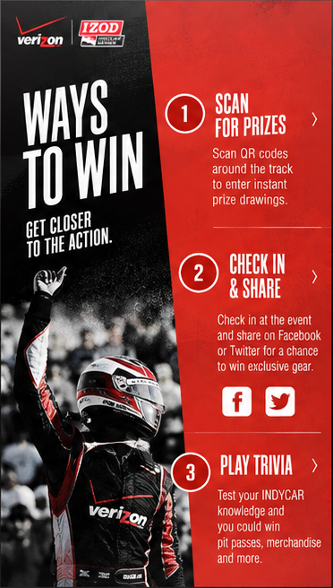
Turn interest into participation.
Verizon’s promotional activities needed one clear place to live. Ways to Win gathered them onto a single screen with three numbered paths shown in the design: scan QR codes for prizes, check in and share, and play trivia.
From the Verizon tent to fans’ own phones.
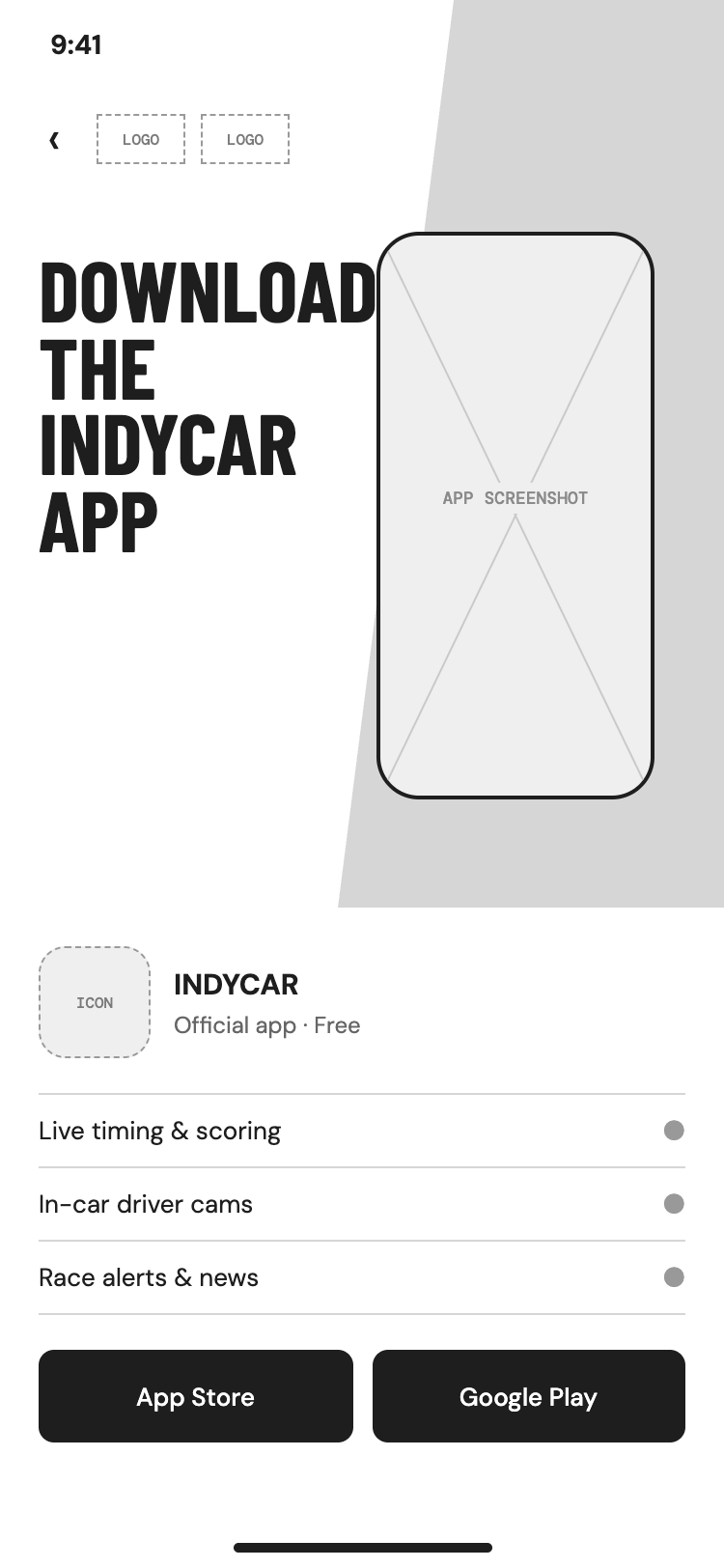
The experience ran on Verizon’s demonstration phones in the tent, but it didn’t have to stay there. Attendees could also open it on their own phones by SMS or by scanning a QR code, so it kept working after they walked out of the tent.
Then we put fans in the driver’s seat.
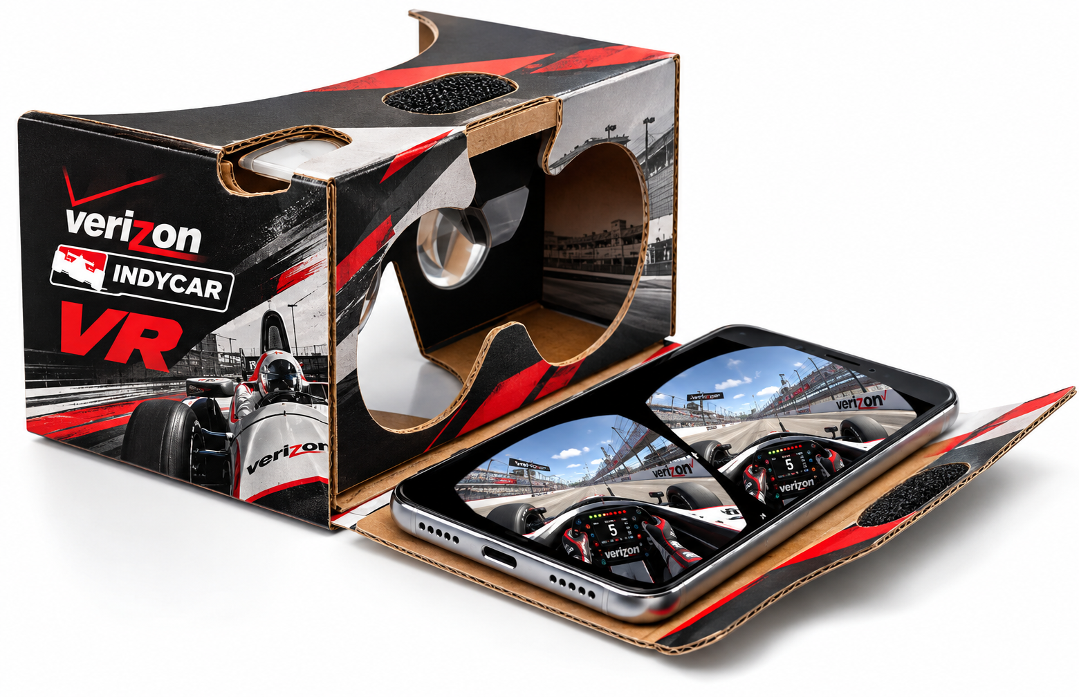
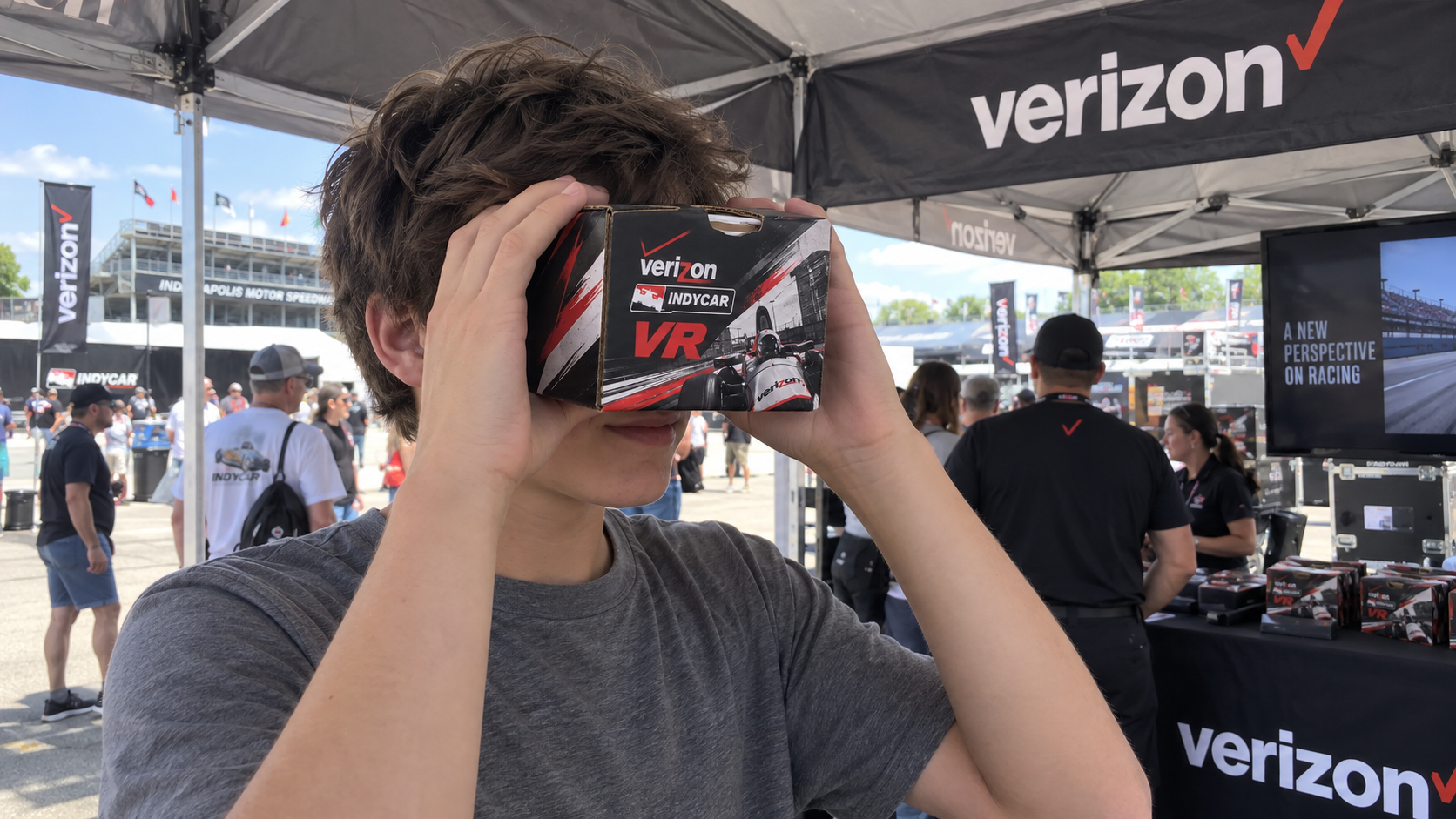
Visitors got a free IndyCar-branded cardboard viewer. They dropped their phone inside and saw a race from the driver’s perspective in the cockpit. The viewer gave fans something physical to take home, and it connected straight back to the digital experience. By the project’s reported results, VR was the most-used feature in the app.
An experience fans picked up — and participated in.
The free branded viewers went over especially well with fans, and the experience reached well beyond the people who happened to be standing in the tent.
Give people something useful. Then give them something to remember.
The schedule and map covered what visitors needed in the moment. Ways to Win gave them a reason to engage with Verizon beyond a quick visit to the tent. And VR gave them a way to experience the sport they couldn’t get from the grandstand.
We found that utility and spectacle work best together. The practical features got people to open the experience, and the immersive one gave them something to talk about afterward.