Rethinking how we see risk.
For Aon, I explored how a traditionally data-heavy climate risk tool could evolve into a modern, visual experience — without sacrificing the complexity underneath.
Climate models are complicated enough. The interface didn’t need to be.
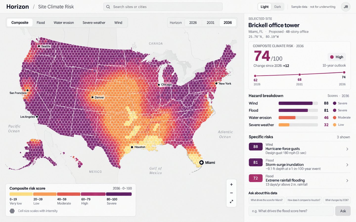
A lot of important information. Not a lot of breathing room.
Climate-risk products need to communicate several things at once: location, hazard type, severity, time horizon, individual risk factors, and how those risks are changing.
The problem wasn’t a lack of data.
It was helping someone understand what mattered without making them decode the interface first.
Before we move forward, let’s go backwards.
To pressure-test the direction, I imagined what the same information might have looked like in an earlier generation of enterprise software: tabs, tables, nested controls, tiny charts and just enough gray chrome to make Windows 95 proud.
NOTE — A speculative, imagined legacy interface. Aon never shipped this. Thankfully, we’ve moved on from Windows 95.
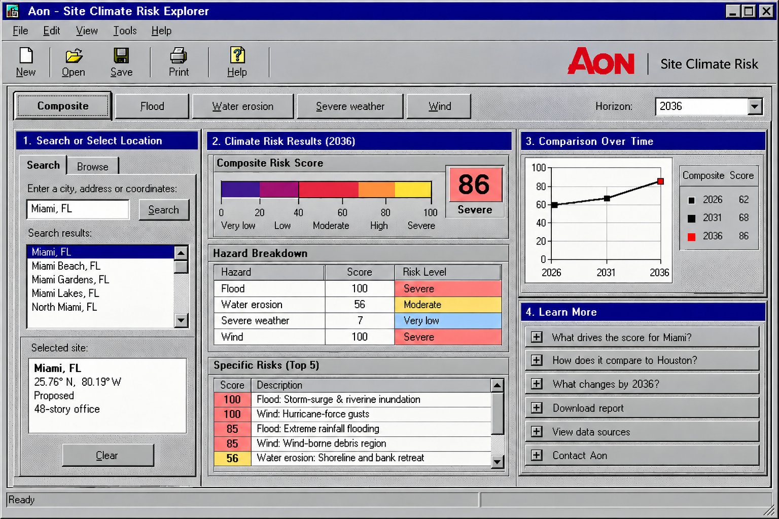
The data wasn’t the problem.
Finding the story inside it was.
Start with the questions, not the pixels.
The interface was organized around a handful of questions someone brings to a site.
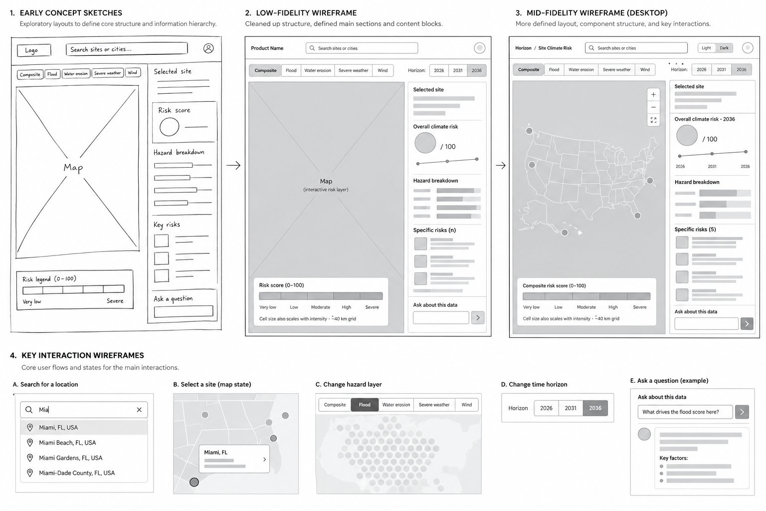
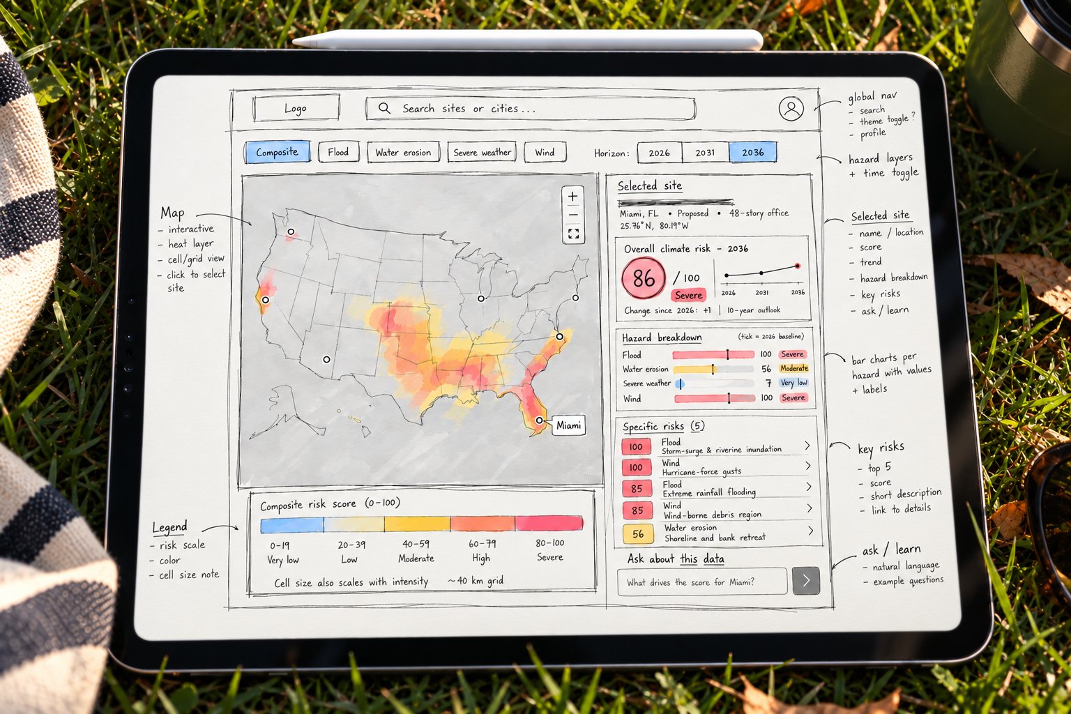
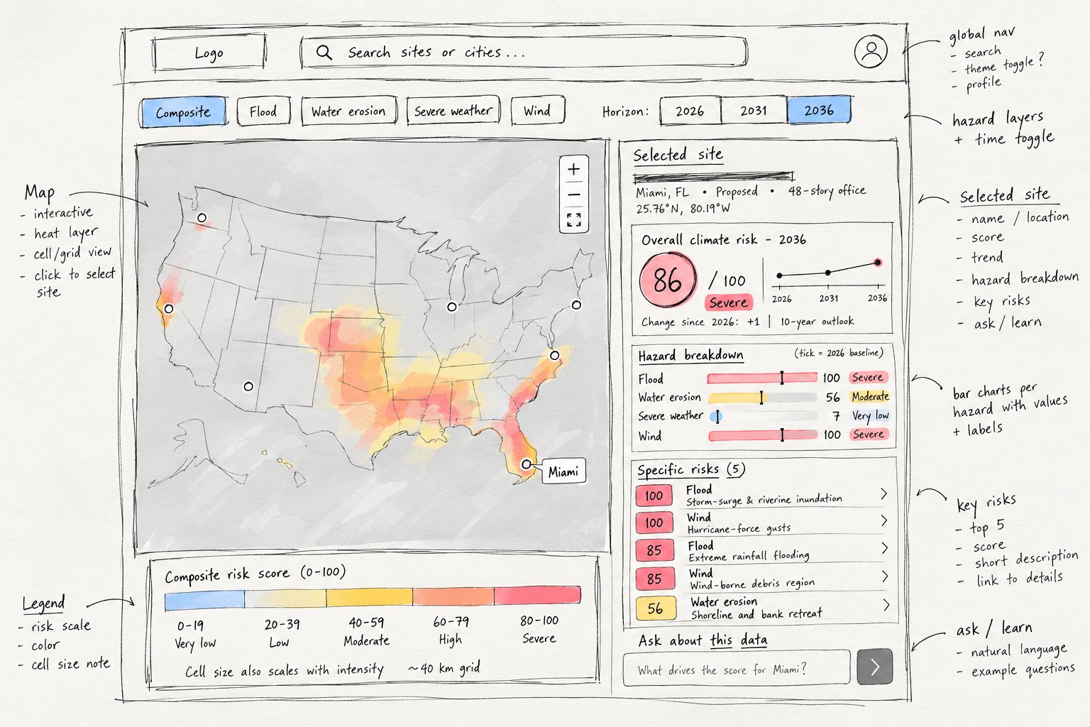
Before it became a system, it was a sketch.
The core layout came together around a simple relationship: geography on one side, explanation on the other. The map gives context; the panel explains what the user is seeing.
Make the map
the interface.
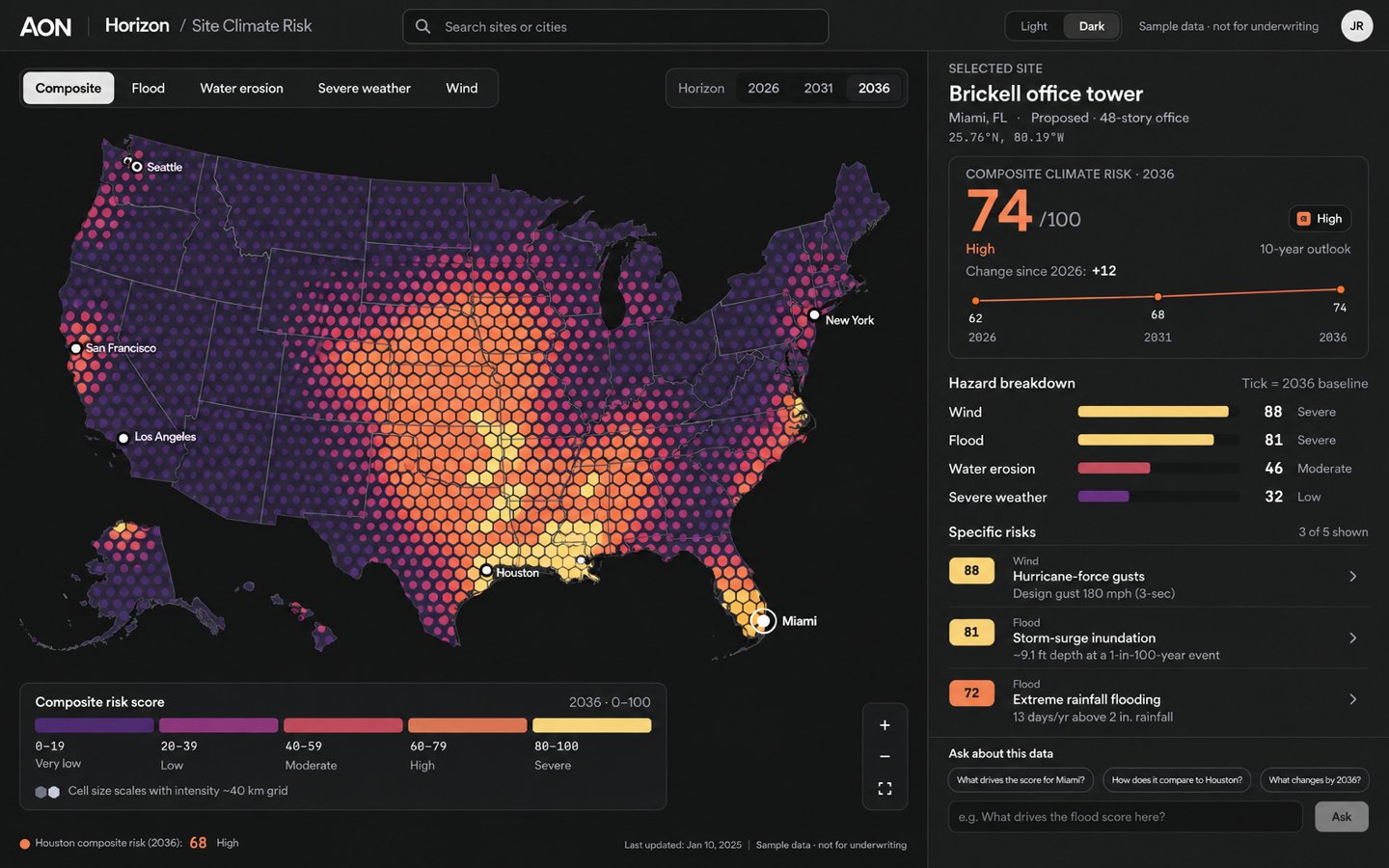
Instead of asking users to move between reports, tables and disconnected views, risk becomes spatial. The user can move from the national picture to a specific site without losing context.
Color has a job.
Risk data has never been accused of being particularly charming, and it shouldn’t be alarming either. The palette needed enough contrast to make patterns visible across thousands of geographic cells, while still supporting labels, charts, selected states and light/dark themes.
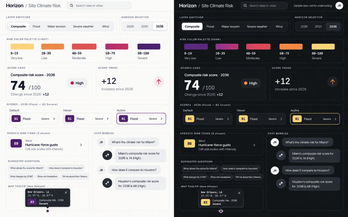
The same risk language carries through map cells, scores, bars, badges, tooltips and comparison states.
Zoom out for the pattern. Zoom in for the reason.
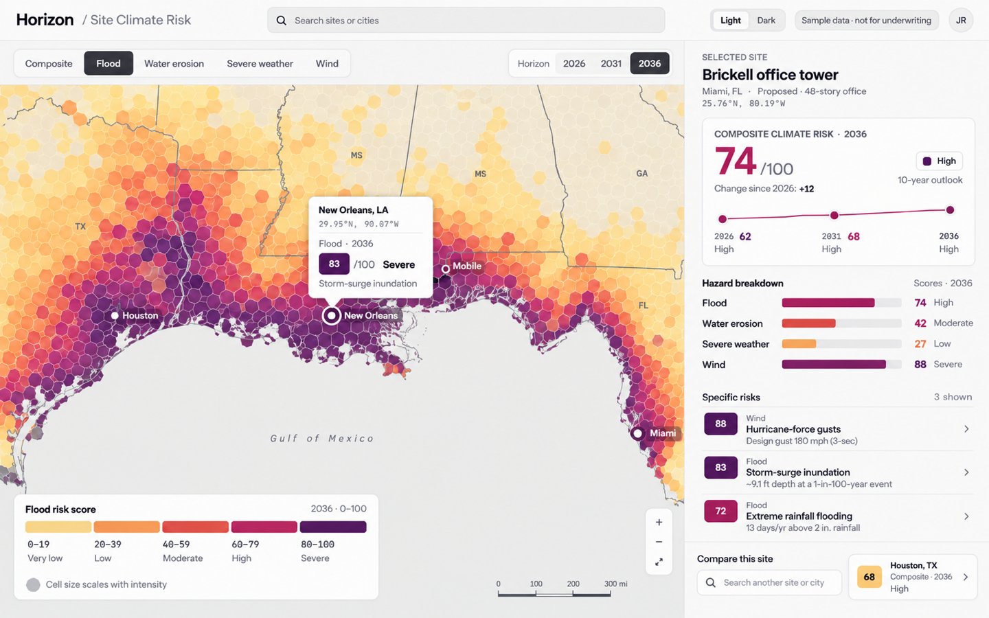
At the national level, the map reveals broad patterns. Moving into a hazard layer changes the question from ‘Where is risk concentrated?’ to ‘What is driving risk here?’
Risk isn’t a snapshot.
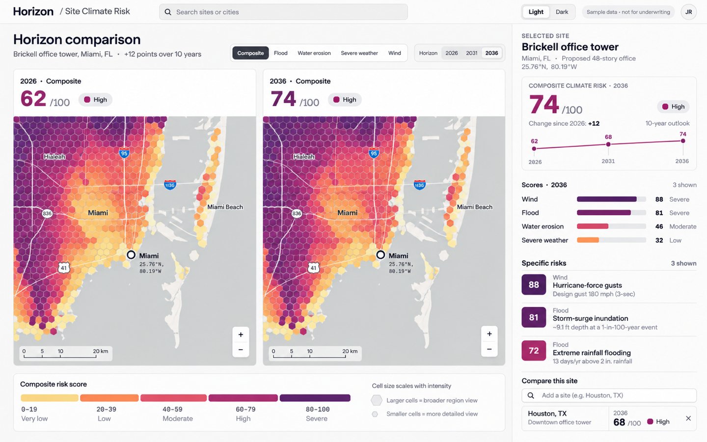
The horizon control makes time a first-class part of the experience. Rather than burying projections in a report, users can compare how a location changes across 2026, 2031 and 2036.
Get me to the place I care about.
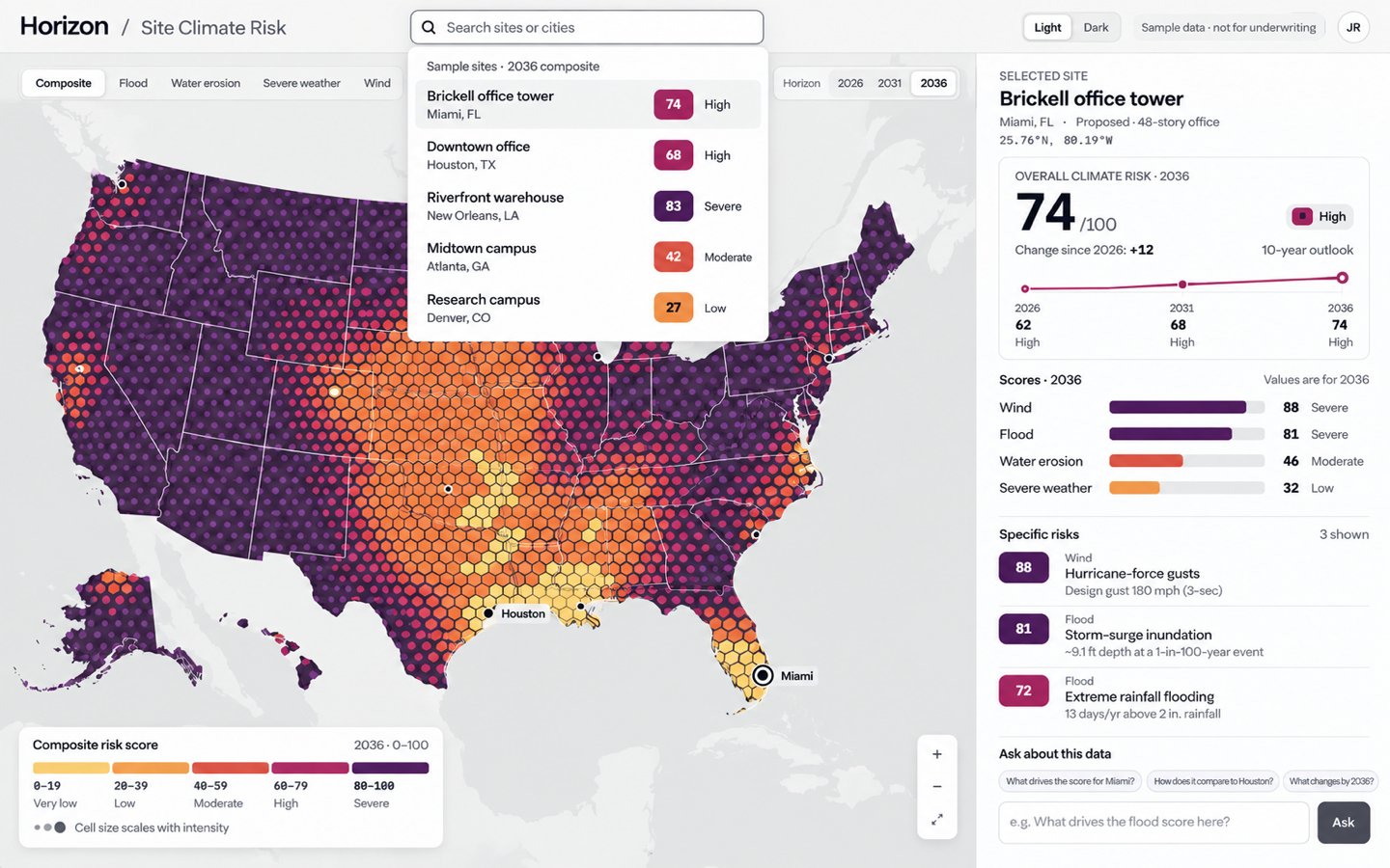
A map is great for discovery. Search is better when you already know where you’re going. It works as a direct entry point into the visualization, so nobody has to pan across a continent to find one building.
And sometimes you just want to ask.
Not every user wants to interpret a legend, compare four hazard bars and mentally summarize a trend line. The conversational layer gives the data another interface: natural language. It sits on top of the same structured scores and drivers — an explanatory layer, not a replacement for the map.
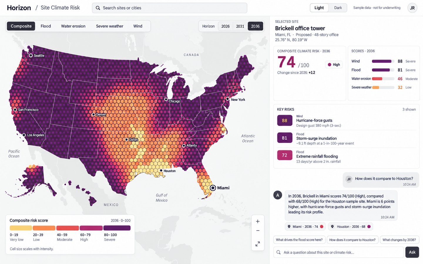
The visualization shows you what’s happening. The conversation helps explain why.
One product. Two very different moods.
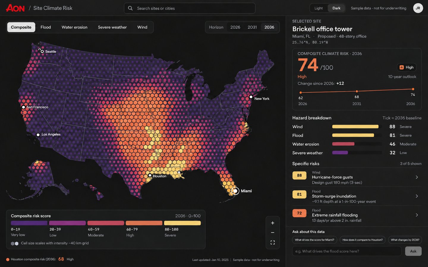
Both themes share one semantic risk system. Surfaces, contrast and the direction of the ramp adapt so severe still reads as severe — whether the map sits on paper-white or near-black.
The best visualization doesn’t simplify the data. It simplifies getting to the point.
This project was less about making climate risk look beautiful and more about making complexity navigable. The strongest design decisions came from deciding what should remain visible, what could wait, and how geography, time and explanation could work together rather than compete.
It also reminded me why I enjoy prototyping complex systems: somewhere between the raw data and the finished interface is a moment where something difficult suddenly makes sense.