From 15 minutes to under five.
We redesigned a dated, confusing loan eligibility form as a conversation. The same questions now arrive one at a time in a vertical chat, answered with a tap, a slider or a short field, so a difficult process reads like a quick exchange with a helpful guide.
Same questions. A conversation instead of a form.
Checking eligibility shouldn’t feel like the hard part.
The original form asked people to navigate an outdated, confusing experience before they could find out whether they were eligible for a loan. On a phone, the task was especially difficult. A process that took roughly 15 minutes needed to become something people could complete quickly and comfortably.
A form that hadn’t kept up with its users.
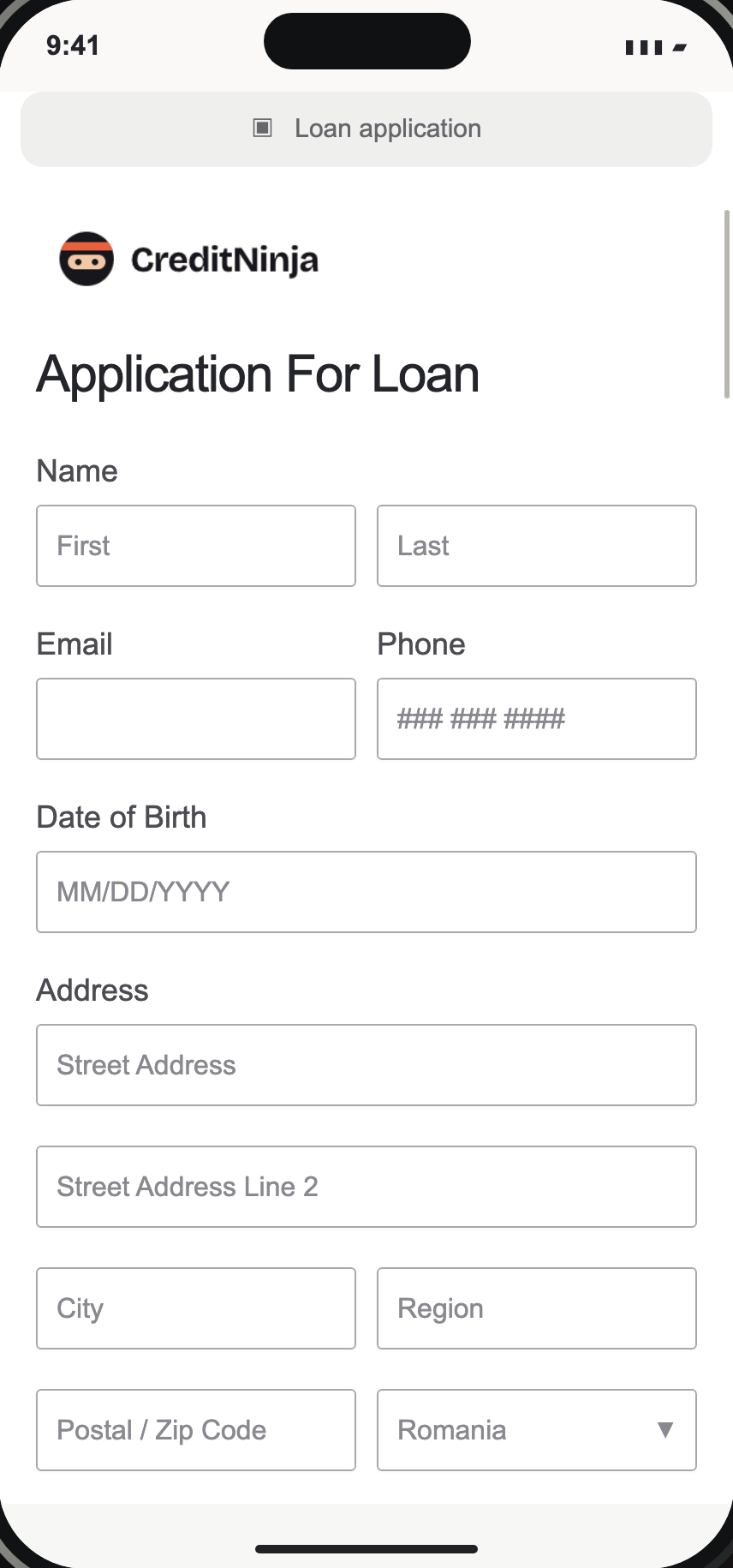
Turn a long form into a conversation.
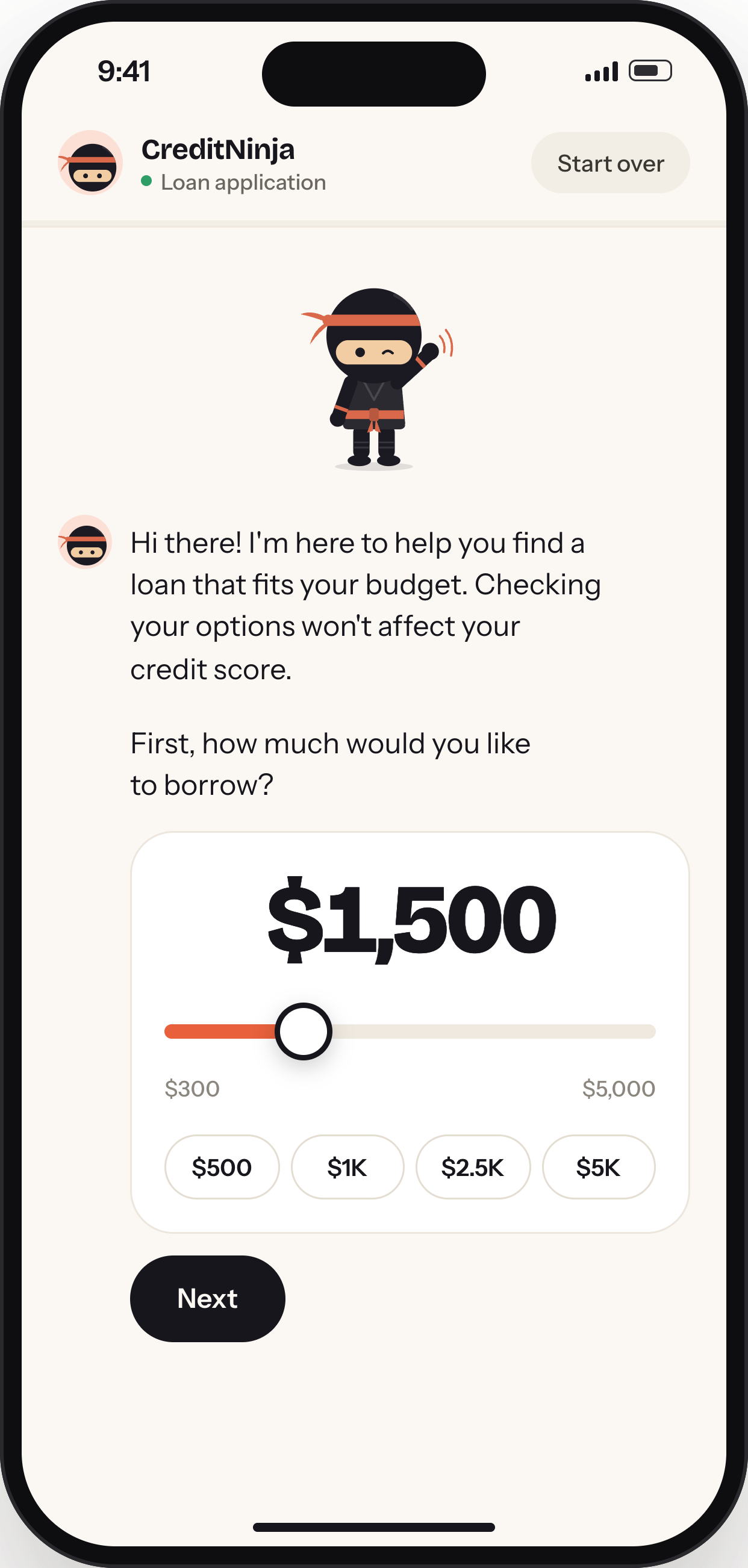
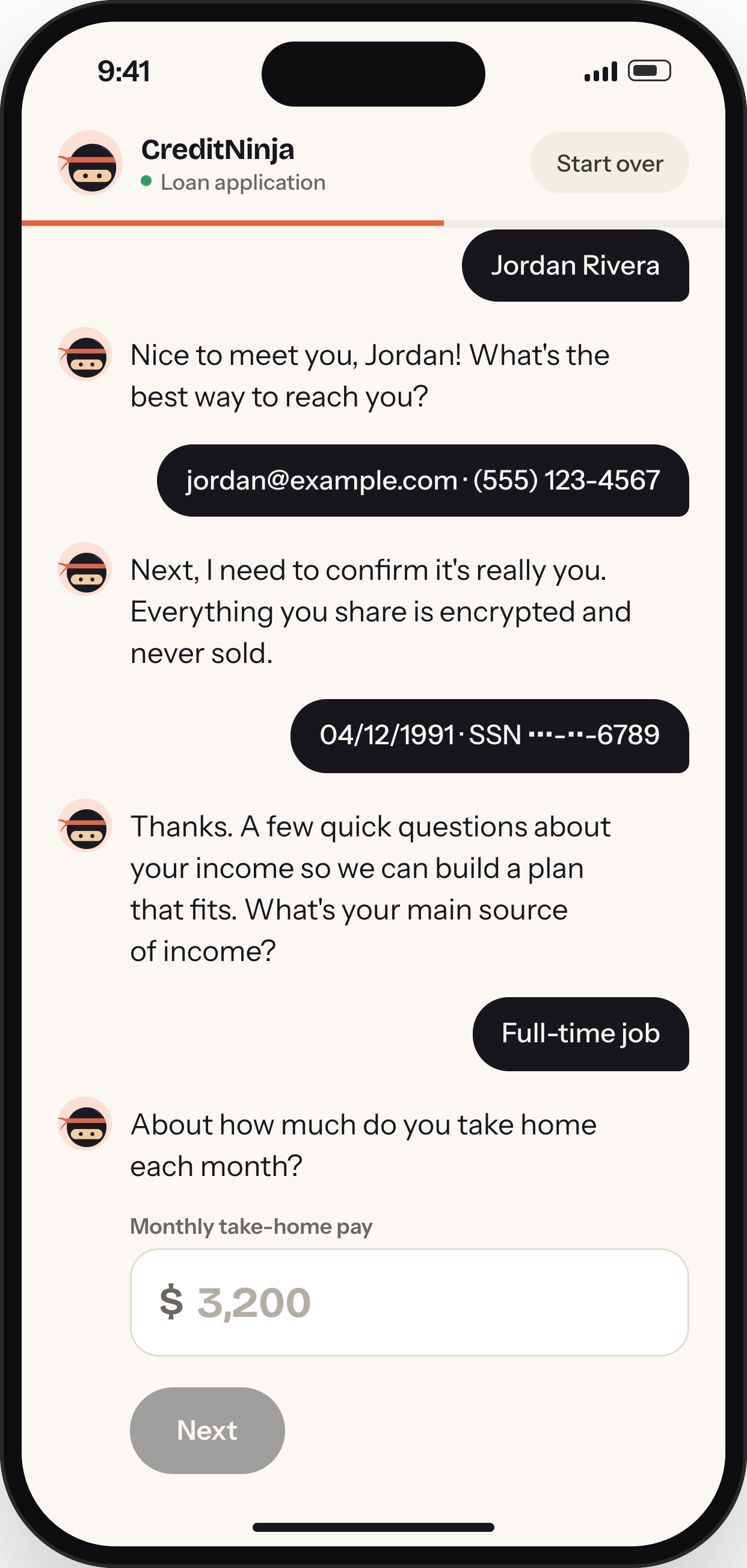
The redesign kept every question and changed how they were asked. Instead of taking in the whole form at once, people answer one message at a time, and the next question appears below their reply.
One question, one reply.
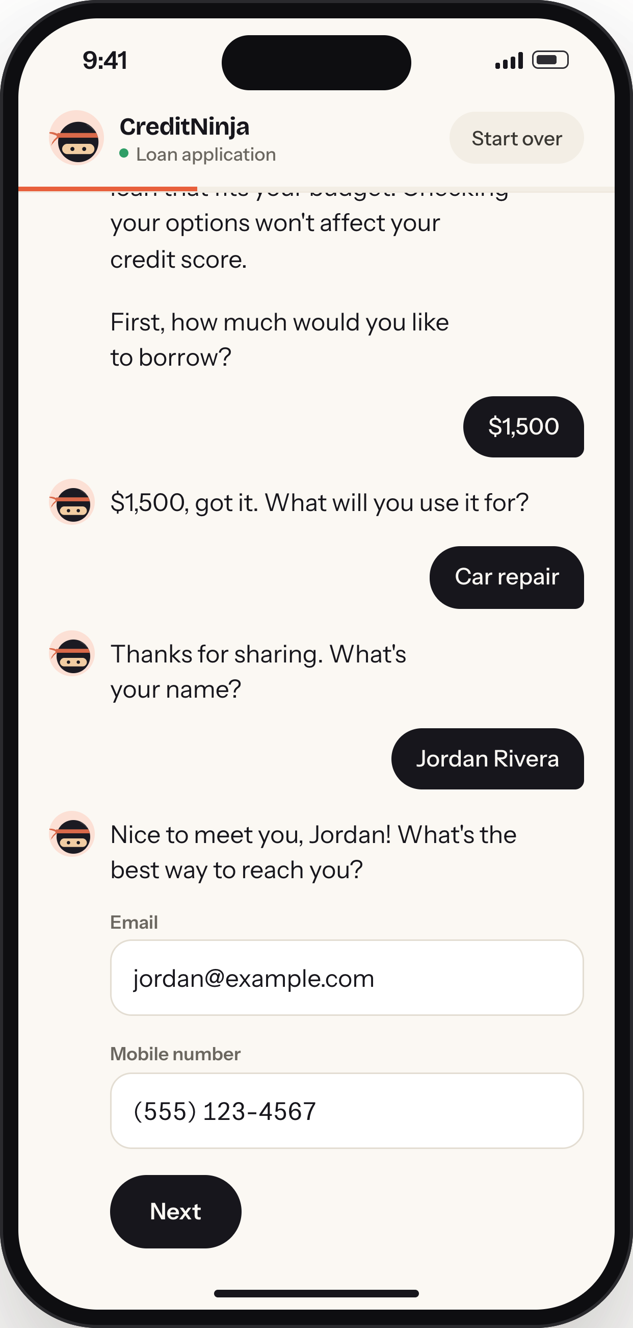
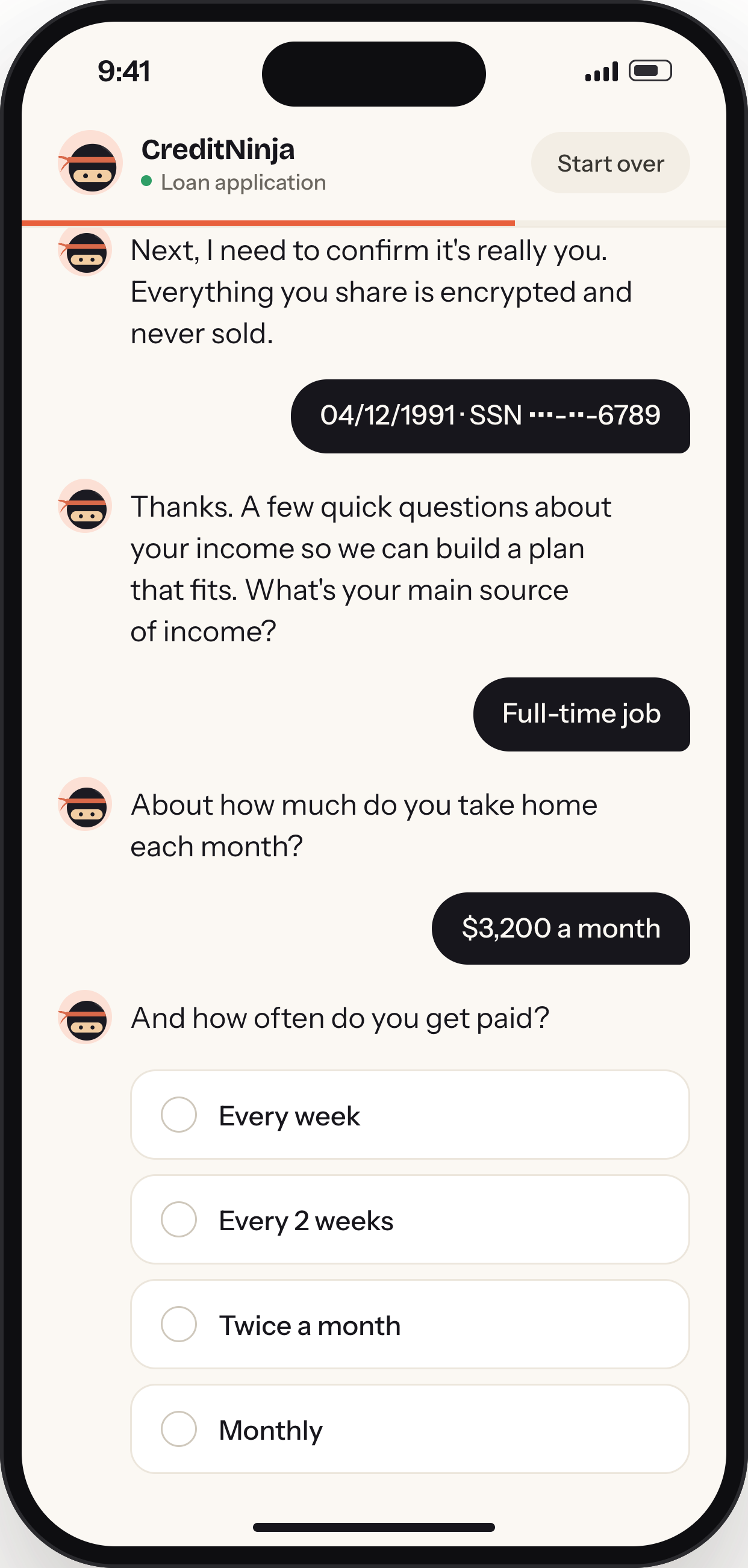
Each question arrives as a message from the CreditNinja guide. The answer controls sit right under it, so there is always one obvious thing to do next.
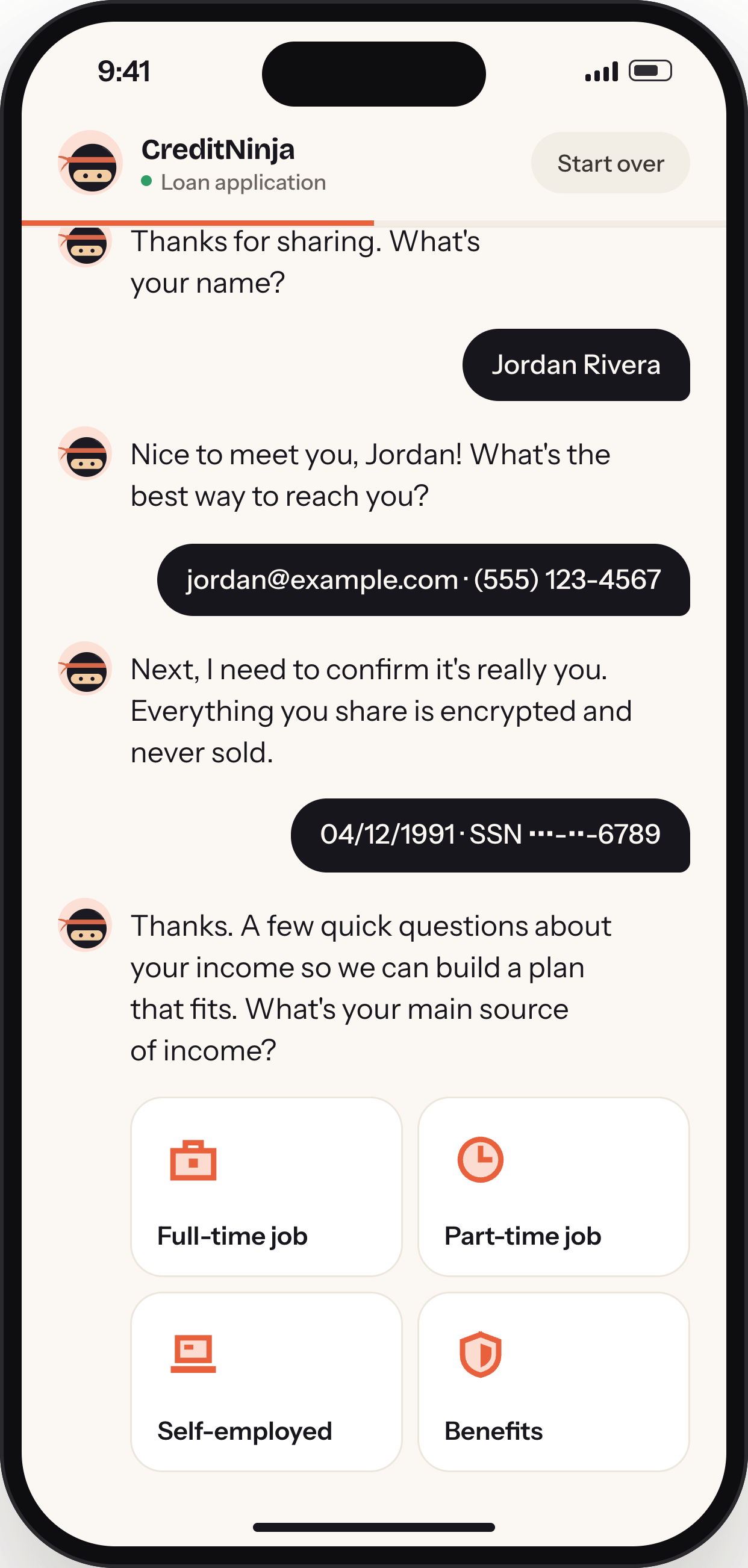
Earlier answers stay in the thread above as a record of what’s been said. People can scroll back to check a reply without leaving the flow.
Designed for the phone in your hand.
People spend their days texting: reading a message, replying and scrolling down to the next one. The redesign borrows that rhythm. Because the thread scrolls like a messaging app and replies sit at thumb height, filling out a form, one of the most dreaded tasks online, starts to feel as familiar as answering a text.
Reply. The next question follows.
After a reply, the guide responds and asks the next question in the same thread. There is no Next button between steps, so the conversation keeps its own pace.
Modern, without feeling impersonal.
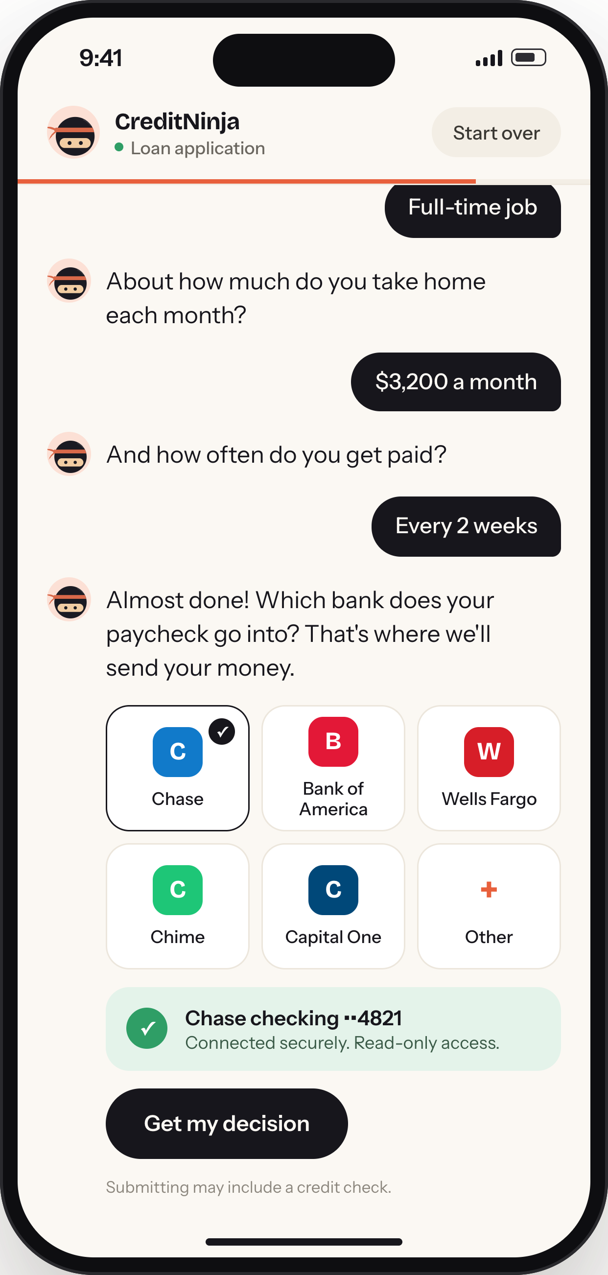
The same purpose. A very different experience.
One conversation, start to finish.
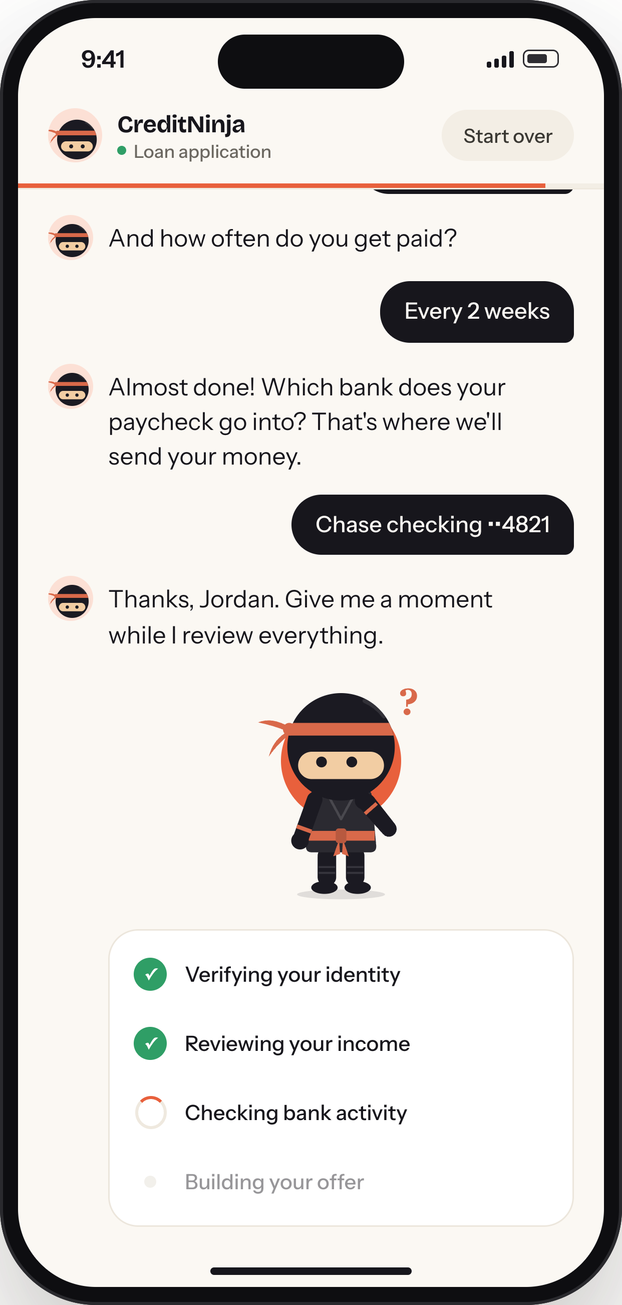
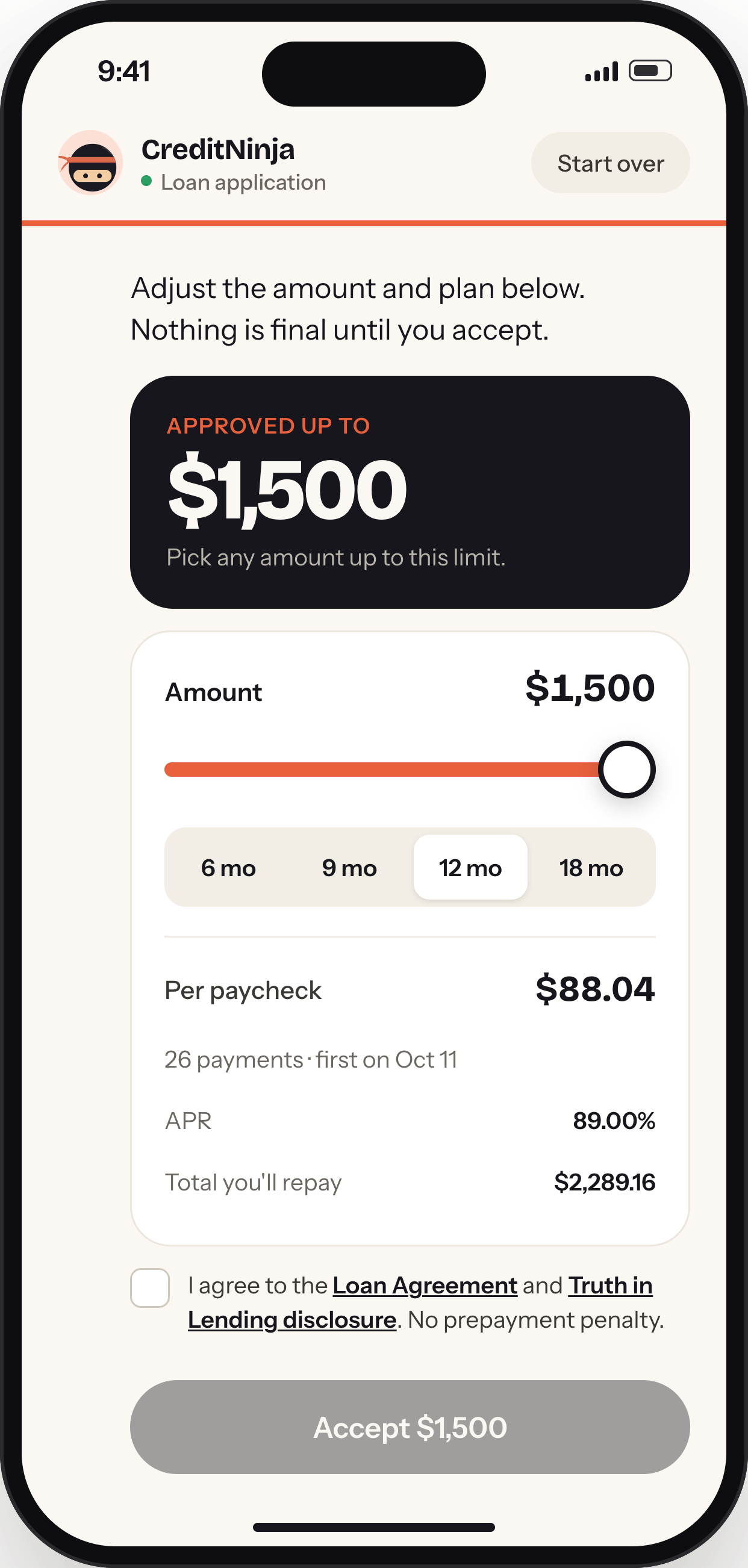
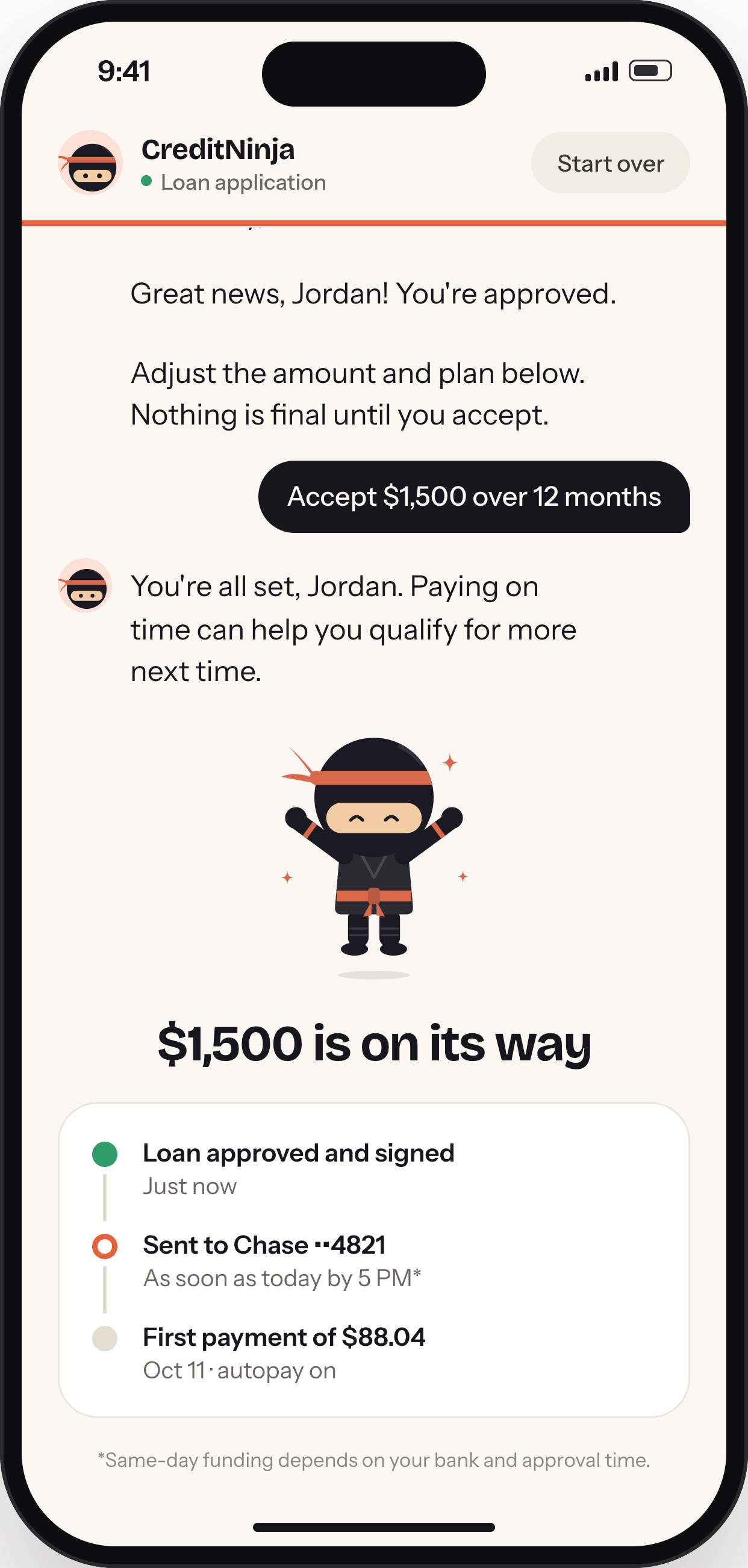
Try the flow yourself.
The prototype runs in the phone frame. Drag the amount slider, tap your replies, and follow the conversation to the end.
A 15-minute task, finished in under five.
People overwhelmingly preferred the simplicity of answering in a conversation. A task that was hard to finish on a phone became a quick, guided exchange.
Make the next step easy to understand.
This project shows how much the experience of a form can change when its interaction model changes. Asking the same questions as a conversation, one at a time, with warmer replies and no Next buttons, made the process feel more manageable and much faster to complete.